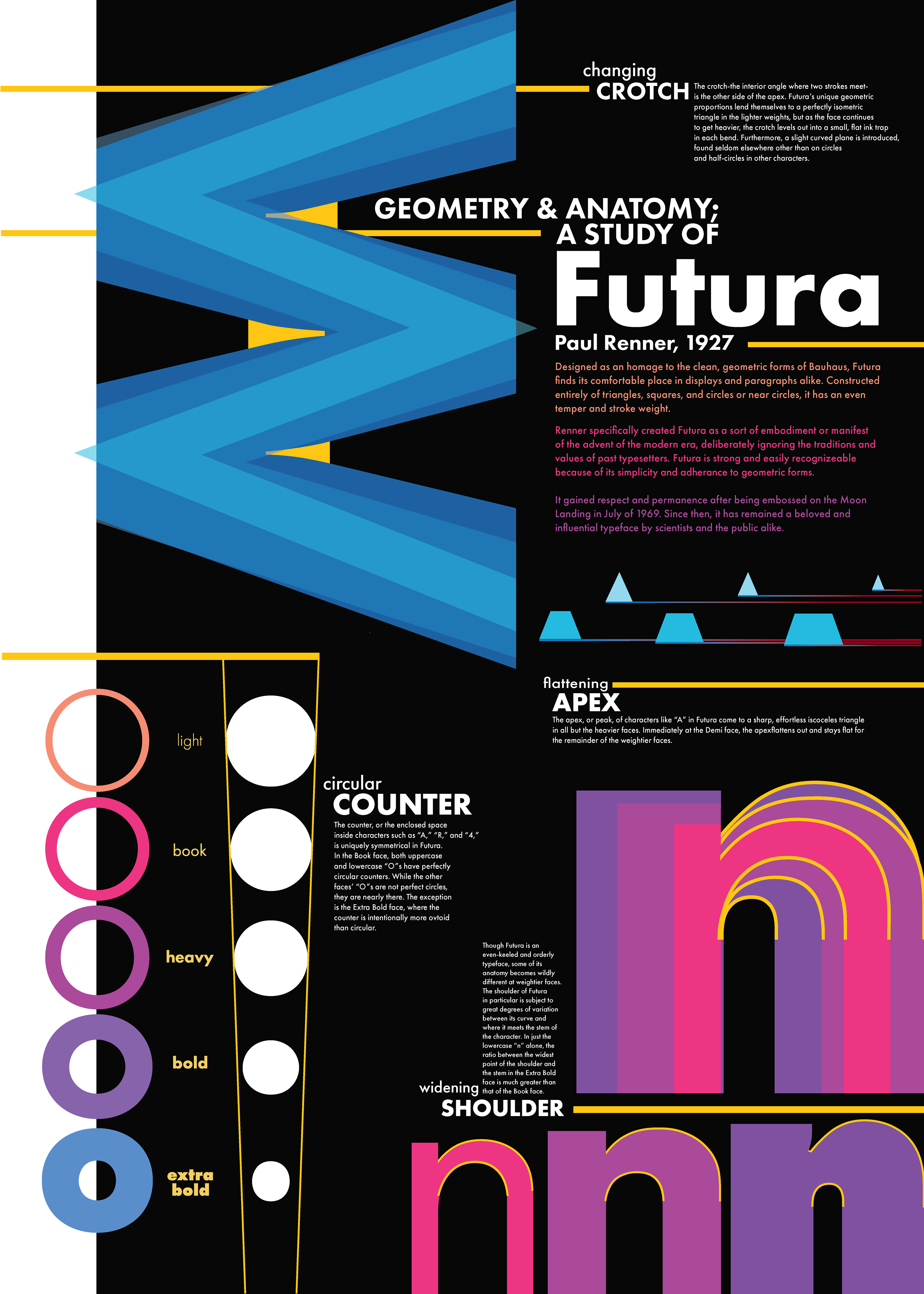
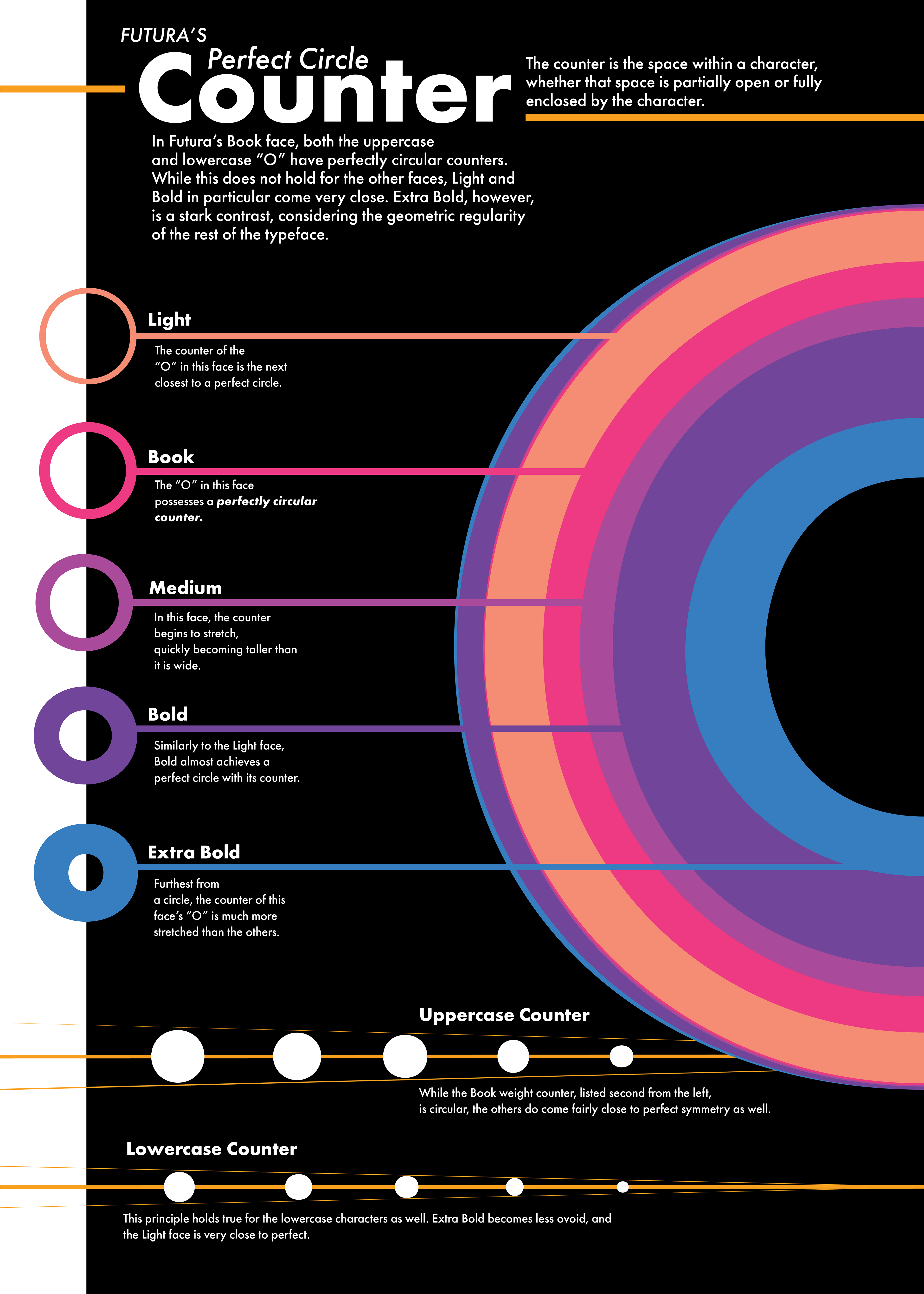
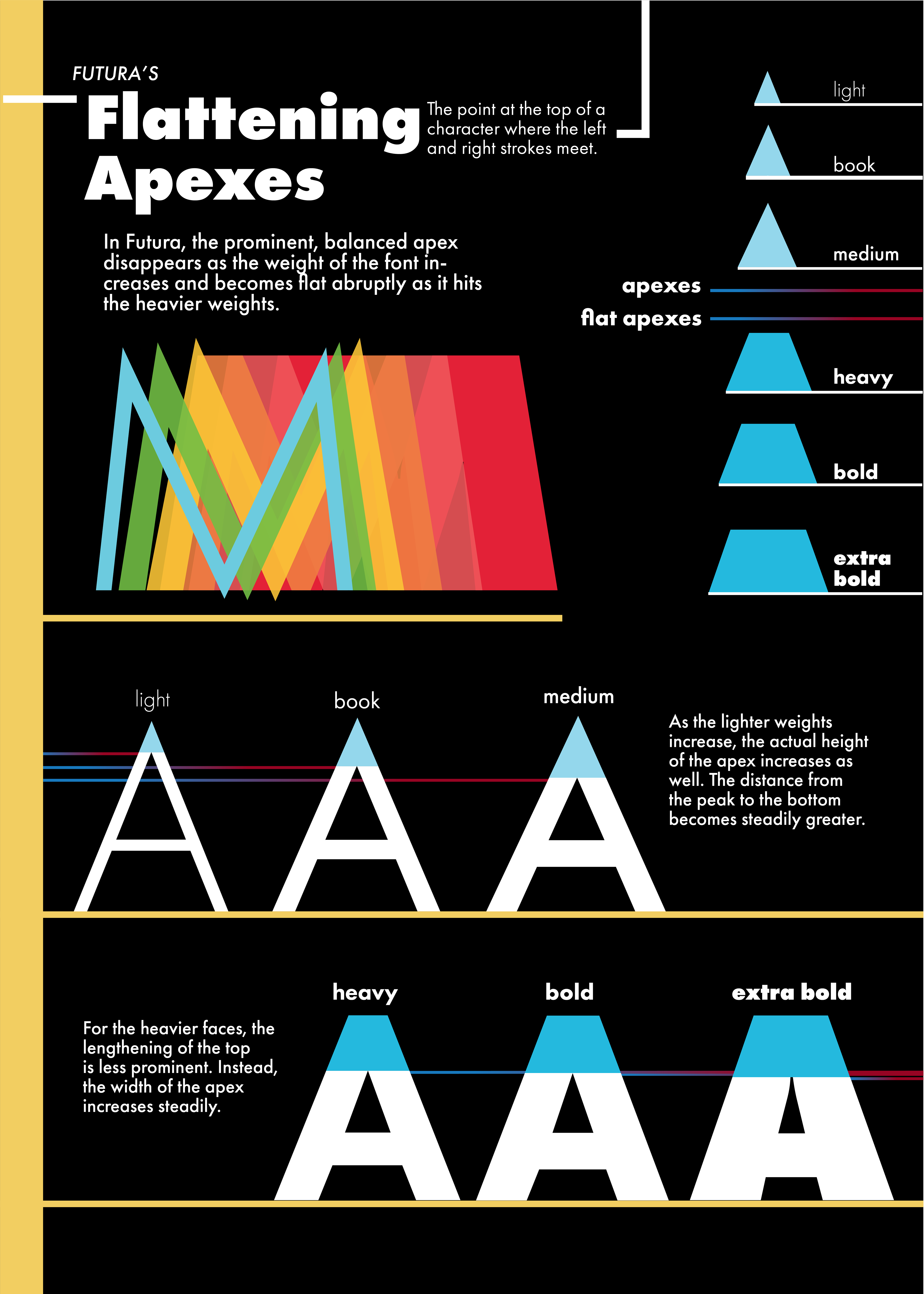
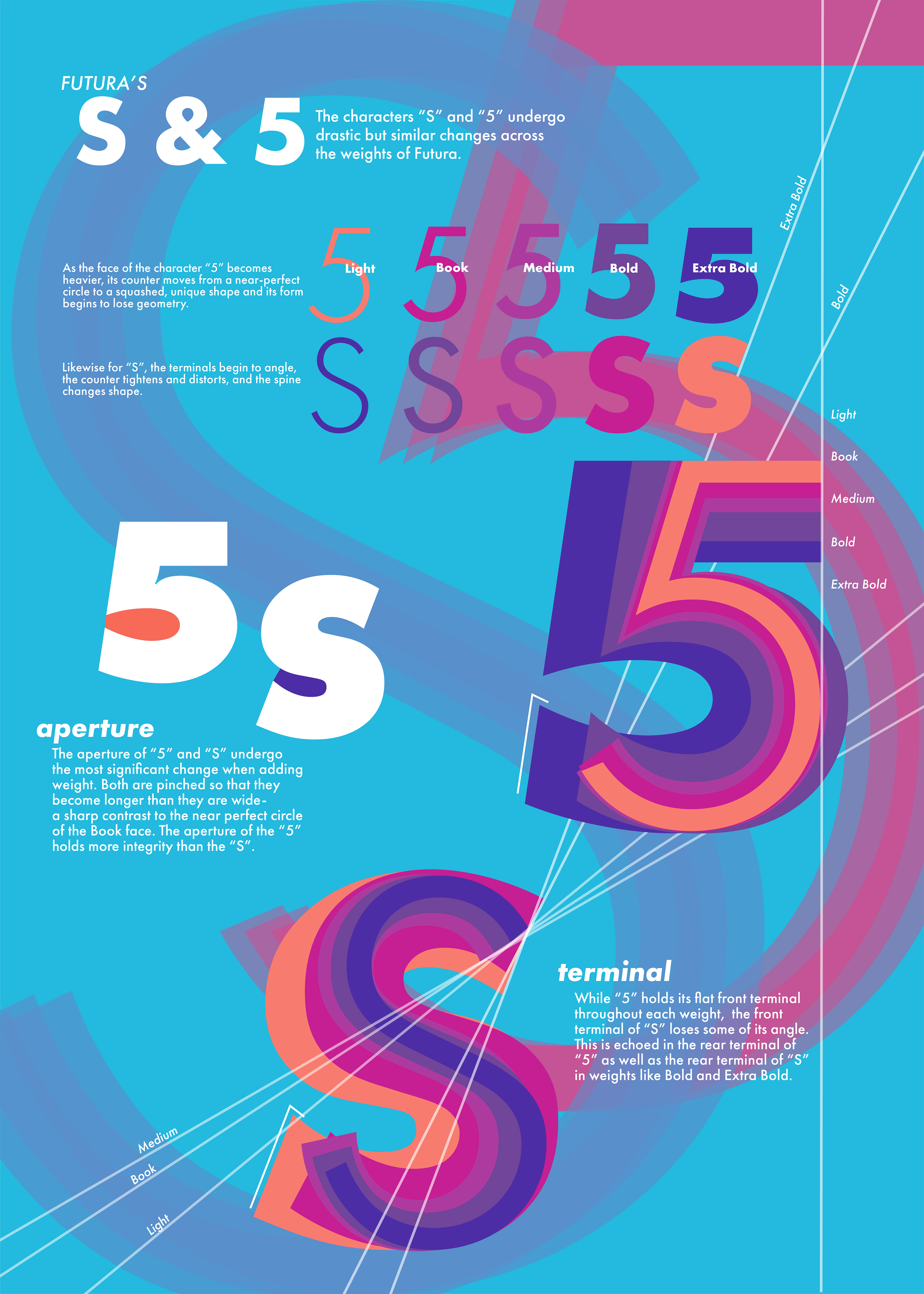
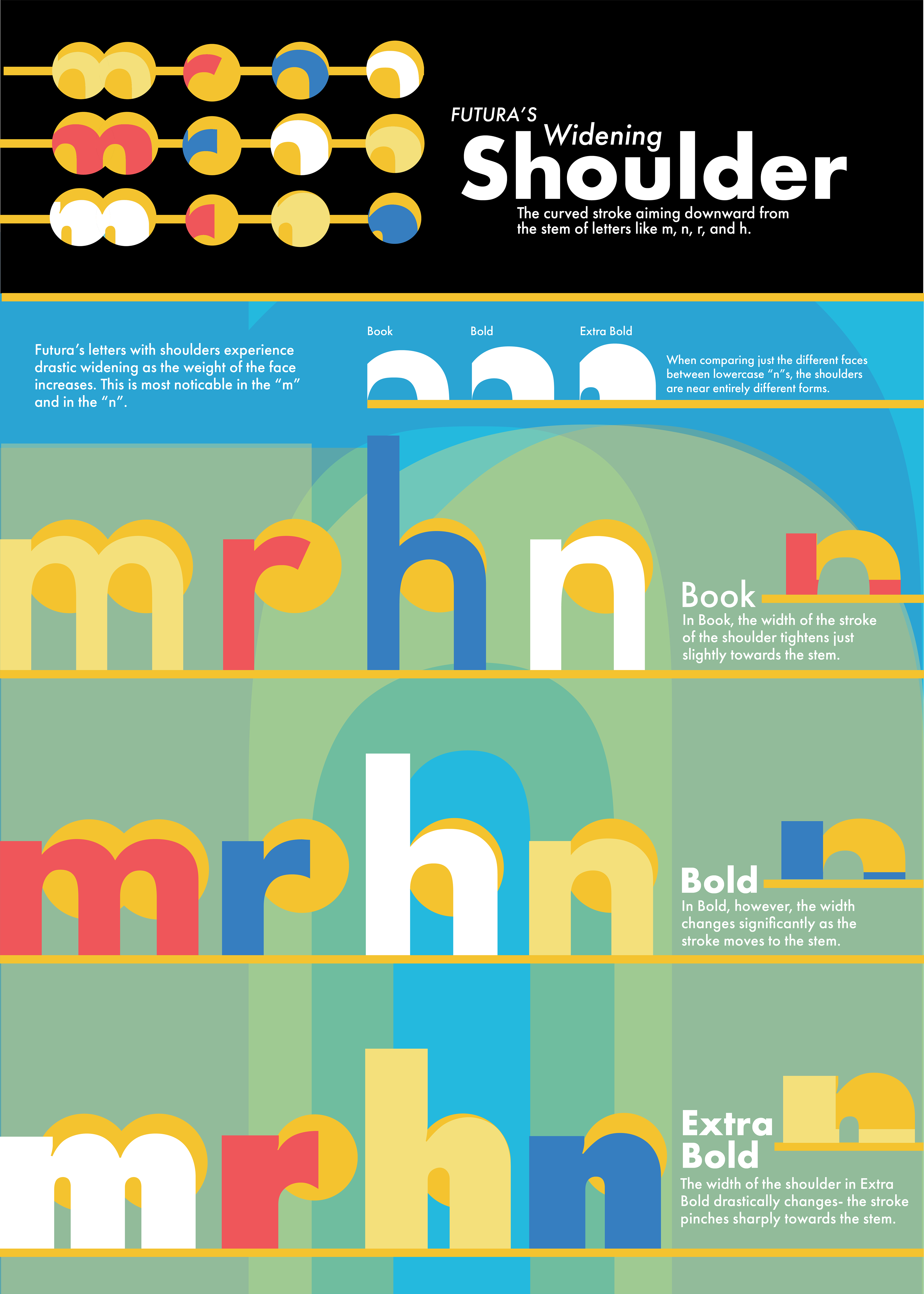
This project is an intensive study of the characters and weights of the type family Futura. We
were tasked with breaking down four typographical elements of a typeface and comparing the
uniqueness of those elements between different characters and weights.
I chose counter, shoulder, crotch, and apex. This study was extremely fun!
were tasked with breaking down four typographical elements of a typeface and comparing the
uniqueness of those elements between different characters and weights.
I chose counter, shoulder, crotch, and apex. This study was extremely fun!
Each poster details one of the attributes, and the final, largest poster featured to the right combines them all into a
unified visual style.
unified visual style.